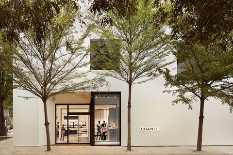
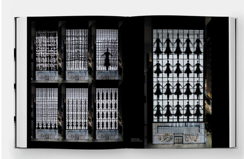
Peter Marino has been designing Chanel buildings for a quarter of a century, 16 of which are documented in a new book, Peter Marino: The Architecture of Chanel, available from Phaidon. The hefty tome features more than 300 images that show how Marino’s particular style complements the codes of the house. The featured buildings include those based in New York, Chicago, Los Angeles, Istanbul, Seoul, Singapore, Hong Kong, Nanjing, Tokyo, Osaka, and the newest Miami Design District boutique, which debuted during Art Basel last week.
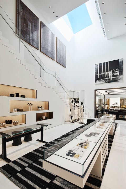
The Miami space, which melds artistic director Virginie Viard’s idea of the brand with Marino’s own, leverages the mood of the city with a white stucco facade and several large, irregular-shape glass windows on the exterior, with gray wave stone floors, white plastered walls, and a stunning 120-foot skylight—all the better to let that Miami sun in. Ahead, Marino speaks with BAZAAR.com about his latest project in South Florida, as well as his long-standing relationship with Chanel, integrating art into his spaces, and how he wants customers to feel.
What was it like looking back at 25 years of designs for Chanel to create the book? Why was now the right time for the book?
The relationship I have with Chanel is rare in architecture. Few companies allow one architect to build 12 buildings in 12 years like I have for Chanel, and that’s why I wanted to record it with a book—a book still remains the best way to record a body of work. To be honest, who knows how long anything lasts—and especially retail architecture never lasts that long. We live in a very disposable society.
What is your relationship like working with Chanel?
Chanel gives me the freedom to create retail experiences that are art. It’s been great to have been entrusted with the physical architectural personification of Chanel. Chanel is a client who is always looking to evolve the brand while maintaining the brand history. It’s within this rich framework that we are bringing to each project an ever-changing architectural context. The work of Coco Chanel was so modern and timeless that it translates extremely well to contemporary architecture and interiors.
How important is art to the new Chanel building in Miami?
For me, it is paramount. We have a commission from artist Chris Succo for the elevator, a linear painting eight feet long by Peter Dayton over jewelry, drawings by Jan-Ole Schiemann in the try-on rooms. Hanging in the atrium are three works by Gregor Hildebrandt—ink-jet prints and plastic cassette tape boxes in wooden cases—and a photograph by Vera Lutter of LACMA, a nod to what’s coming next (a new Chanel on Rodeo Drive is slated for completion in 2022).
Artwork needs its own breathing space and isn’t meant to compete with merchandise, so I don’t place it alongside the product. It may float above as you see with Gregor Hildebrandt’s three works over the 40-foot white staircase, or occupy its own zone, in the case of Chris Succo’s elevator installation—where he spray-painted black lacquer and oil on white linen. It’s meant to be appreciated in its own context.
In light of being at Art Basel, what is your process for discovering talent to highlight in your spaces?
At Art Basel, it’s an opportunity to see and consider new artists, new work—my process at Art Basel is the same as anywhere in the world. In New York, London, Venice, Milan, Paris, I go to galleries and shows, I gather ideas, I make meaningful connections, and I take notes and consider artists that could work for different projects.
How did you want clients to feel when they enter the new space?
I want them to feel like buying a handbag!
This content is created and maintained by a third party, and imported onto this page to help users provide their email addresses. You may be able to find more information about this and similar content at piano.io
Peter Marino on The Architecture of Chanel and 25 Years with the House
Source: Filipino Journal Articles


0 Comments